
Red is a stimulating, active color, but it is recommended to combine it with other shades for furnishing. Otherwise, the interior acquires overly aggressive features. Even for a well-lit room, it will seem excessively intense and gloomy. But with the right choice of the primary color or companion, the situation changes dramatically. The interior with red accents looks elegant and beautiful.

The most commonly used combinations are:
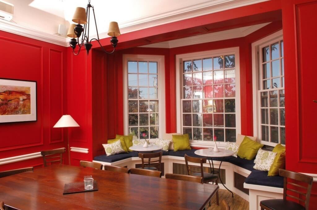
- The red and white range is usually used for common areas such as kitchens or living rooms. Both colors are pretty bright and independent, while white balances out the vibrant red.
- The red and black combination should be used with care and balance. Usually, accents are chosen in such a palette, for example, black furniture with red decor against the background of the general gray color of the scenery.
- The red and gray combination can be used for the bedroom. In this case, the primary palette is made in gray, which makes it neutral and calm. Red only dilutes the atmosphere. It can be used for pillows, upholstery of one or two chairs, as an unusual pattern. This combination can also be used for a well-lit kitchen. In this case, any shades of red can be used to decorate the headset.
- The combination of red and green appears to be harmonic and pleasant, but the appropriate tones must be chosen. Muted and soft tones, such as olive and dark wine, will be the best choice for living rooms.
- For a classic interior, you can choose a combination in which the primary color will be brown, and the secondary color will be red. Due to the proximity of the spectrum, the palette looks harmonious and calm, helping to create a comfortable atmosphere.
- Red can be used for rooms with low natural light levels. These will be bright accents that look interesting against the background of the primary orange, warm sandy, beige shades.
- Combinations with blue and light blue should be used with extreme caution. Such interiors, if handled correctly, will be attractive, but red is used in small doses.
When choosing any combination, it must be borne in mind that red refers to vibrant colors. Therefore, it is best to choose it as an addition, to balance it with calm shades or unusual accents.
Features of choice for modern or classic style

When planning an interior using shades of red, it is recommended to give preference to simple forms. For example, with matte or glossy surfaces, the use of muted tones without unnecessary or excessive decor would be an excellent solution for modern furnishings. Furniture can be made in burgundy wine shades. This color is allowed for walls or floors. But it needs to be balanced to make the background calm.
For classic furnishings, dark, deep tones are recommended. In this case, red will go well with olive, emerald, gray, blue colors. The decoration of textiles and walls can be complemented with patterns, but they must harmonize with the overall design.
For loft-style furnishings, red is usually used in the manufacture of furniture. It can be an original bright sofa or chairs, an unusual wardrobe, or wall decor.
Red is often used for country-style interiors. These are muted or dark colors used for upholstery of upholstered furniture, painting of cabinet facades. Maroon curtains, knitted bedspreads, or capes will look unusual and attractive.
Red furniture for a modern interior
This type of furniture always attracts attention. It looks extraordinary and bold, but this is what imposes certain restrictions on interior planning. It’s best to limit yourself to one or two red pieces of furniture.
Attractive solutions will be:
- Upholstered furniture with red leather or fabric upholstery will be in perfect harmony with the main calm shade of the walls, light flooring, natural wood.
- You can choose unusual red chests of drawers with carvings, enamels, or glossy dark glass inserts for the bedroom. This option is ideal for a modern interior, making it more expressive.
- For the living room, bedroom or hallway, you can use a large built-in wardrobe with red doors. It is better to cover the facade with a matte finish, choose one or two accents in the same range.
- For the kitchen, red can be used to manufacture a work area, chairs, or a table; an attractive solution would be a bright red glossy countertop or individual accents.
- For a living room in this color, you can arrange upholstered furniture, giving preference to non-standard shapes and bold design;
- This color is used in dosage for a bedroom, usually finishing the headboard, lamps, or a soft corner.
It is not recommended to use a lot of red for children’s rooms and hallways. In the first case, the situation will be too saturated, which is not suitable for the child. A small room will visually seem even more minor in the second, and it will become uncomfortable.
When deciding to use furniture in red, it is recommended to customize it. This makes it possible to consider all the interior features to make the environment convenient and comfortable. Furniture holding “Angstrom” offers the production of furniture for the home in any style and color. Preliminary measurements will be made, and if necessary, an individual design will be developed by the customer’s wishes.


