
The sea element has always been an inspiration for artists, poets, and musicians. Its alluring depth, hiding ancient secrets, scares and at the same time attracts aspiring adventurers. Aqua color in the interior has also gained popularity due to its broad palette of shades. Correctly selected shades can both calm and nudge the owner of the house to action.
Best color combinations

The color of the sea seems cold and overly bright only at first glance. A brilliant combination with other shades of the spectrum can transform even the most boring interior. In this case, the primary tones are as follows:
- Turquoise. A bit of yellow can be added to the base marine color.
- Green. The tones that make up this group are blue and green. These include emerald, malachite, etc.
- Gray-blue-green. This color is the result of a mixture of marine and gray (black). The result can be a mysterious black sea or a muted classic blue-green combination.
Each of the mentioned above can be skillfully used both as a base and for placing the necessary accents. The color companion should be given additional consideration in this scenario.
White
The most popular and frequently used combination. As a pair to aqua, you can use snow-white or milky. In this case, the shade of cyan will not make any difference. Marine can be used as a base wall color. In this case, the furniture should be dominated by white or beige. If snow-white is chosen as the primary color of the interior, the blue-green palette will come to the rescue when placing the necessary accents. In any case, such an interior will be strict, with clear lines of demarcation. The inhabitants of such a house themselves will involuntarily strive for order.
Gold
Another combination that has gained well-deserved popularity among designers. The variety of gold and blue-green colors looks most advantageous in a classic interior. At the same time, a harmonious tandem can be both a primary base (wallpaper pattern) and an element of decorative trim (frames, pillows, vases, etc.). A calm beige tone will come to the rescue if the apartment owner is inclined to less pompous combinations. This color, combined with the marine color, will give a softer and more favorable result. A room decorated in these colors will be brighter and more comfortable.
Brown
The best tandem would be a combination of cold cyan and warm brown. As a result, any room will become cozy at home. In turn, the variety of dark chocolate and other cold tones of brown with the sea will look spectacular. To achieve the best effect, blue-green should still be the priority. Otherwise, the interior can become gloomy and dull.
Red and yellow
The combination of this range and the color of the sea has always been a win-win. This is due primarily to the ease of variety. Cyan and red and yellow colors can be of equal importance in interior decoration. You can also use the specified palette as decor with a basic white or beige base.
Black
The most controversial color partner of the sea wave. As with brown, black should be used for accents. When choosing basic cyanogen, it is better to give preference to cheerful light colors. Thus, the apartment owner will receive an engaging, non-standard combination, strict and stylish at the same time.
Purple and green
It is preferable to use both of these colors in combination with blue-green hues. The main thing, in this case, is harmony. Yellow and purple can be used in numerous details. Thus, the room will become brighter, which means it will emphasize the individuality of its inhabitants.
Pink
An unexpected combination. As a result of the skillful placement of accents, the house’s interior will become incredibly cozy and romantic. The pink palette can be used in decor or as the primary color of the furniture. The best choices are light shades of cyan and delicate peach tones.
The marine palette in the interior of different rooms
Thanks to the harmonious combination of shades, you can transform any room. In such a matter, you need to focus not only on the variety of colors but also on the general style of the interior and the room’s purpose.
Kitchen

Blue-green, in this case, can be used in two ways:
- Wall color.
- The primary palette of furniture fronts.
In the first case, the marine will be an excellent base for furniture and wood-colored floors. This combination will look spectacular and will preserve the necessary home comfort.
If the kitchen owner opted for a furniture set in the color of the sea, white would come to the rescue. It can be applied as a background or a foreground (wallpaper, paint, wall tiles) and an additional color for the front of the cabinets. For example, the lower tier is a bright turquoise color, and the upper one is snow-white. At the same time, do not forget about curtains, flower pots, napkins, and other decorative elements. The result is a cheerful, light kitchen.
Living room

When choosing a blue-green color for wall covering, you need to pay attention to the windows. There should be a lot of light in such a room. It should be borne in mind that the living room is the most comfortable room beside the kitchen. It is here that the whole family most often gathers to watch their favorite movie, play a board game, etc. You must pay great attention to the finer points of the situation the details in this article—a combination of cyan and brown. As a result, the room will remain warm but will acquire specific energy.
So, the blue-green palette will be an excellent option for pillows, curtains (curtains), vases, etc. At the same time, don’t forget about purple and green shades. You need to place accents very carefully so that the interior of the room does not become vulgar. So, delicate purple can be used as a frame for a desktop photo. Live plants in clay pots will become a bright green detail.
Bedroom
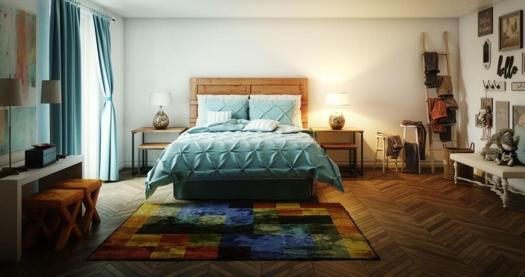
In this case, you need to focus on your preferences. Marine can become the primary background color. To cover the walls of the bedroom, it is better to stick to the lightest hues. In this situation, it is better to choose furniture either light or saturated dark colors. This is where the cyan / dark chocolate tandem will find its application.
An alternative would be to use blue-green in the details. Bed linen, carpet, and other nautical elements will give the room a fresh touch.
Children
When decorating a room, you can focus on the classic colors of Provence. In this situation, we are talking about a combination of light turquoise and pale pink. Such an interior will have a calming effect on its little owner. At the same time, it won’t look boring. For more variety, it is worth turning to the auxiliary green and purple tones.


